
Year
2023-2026
Role
Experience Designer
Skills
Component Architecture
Design Ops
Overview
The design system existed. The knowledge around it didn't.
Repeated launch work exposed the same friction: designers relied on scattered documentation, trackers,
and team knowledge to understand which components were available and how they should be used. This
often meant spending extra time searching for guidance, rebuilding familiar patterns, or asking teammates
for answers that weren't documented in one place.
Our UX team saw an opportunity initiative to make that knowledge as reusable as the components themselves.
I initiated a shared component system that brought reusable patterns, usage guidance, and documentation
together—helping designers work more efficiently while giving PMs, strategists, and enginerring partners
clearer access to the information they needed.
Navigating the problem
Component information lived across disconnected guides, trackers, and files.
Fragmented knowledge

and critical usage knowledge lived in conversations rather than in the system.
Knowledge dependency
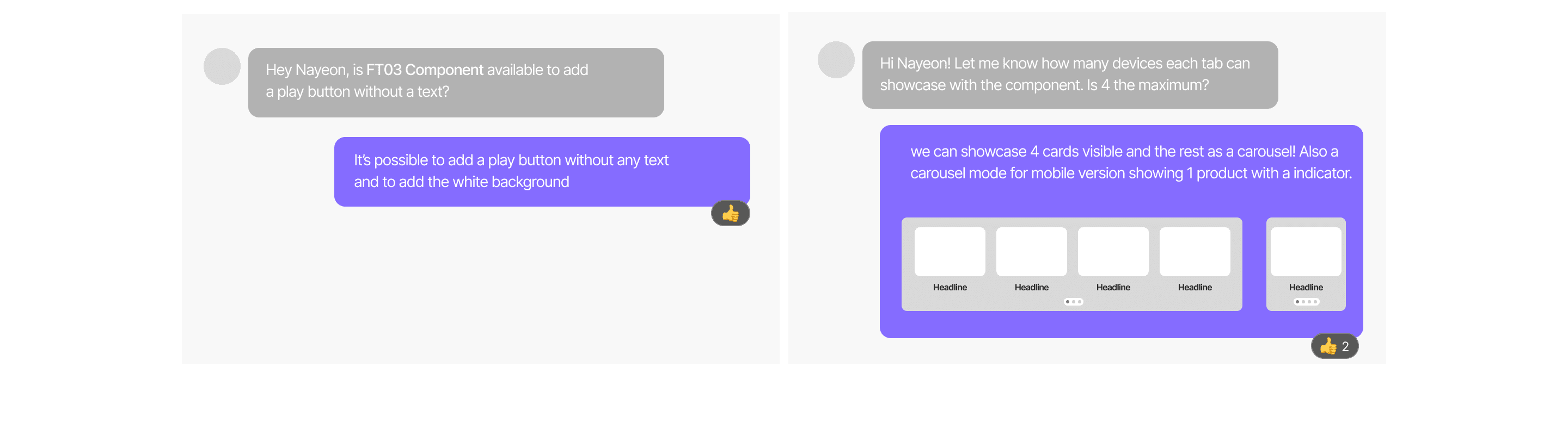
The opportunity was clear: make component knowledge as reusable as the components themselves.
Design Opportunity
How can a shared system make components
easier to find, understand, and apply?
Design principles
Three principles shaped the system.
Contextual Efficiency
No more searching through scattered guides. Deploy device-specific components instantly to accelerate product delivery.

Single source of truth
Consolidate documentation into a single, living repository that scales seamlessly alongside product updates, guaranteeing design integrity.

Cross-Functional Language Governance
Bridge the gap between Design, Product, and Engineering. Establish clear rules so everyone builds from
the same page.

Building the system
Capturing the rules behind each component
Rather than simply recreating existing components, I focused on capturing the rules behind them—when
they should be used, how they behave responsively, and what variations designers actually needed.
This annotation system also created a shared language between design and engineering, reducing ambiguity
during handoff.

Scaling the system
One shared library for 150+ components
We organized reusable components and their supporting guidance into a shared library, creating a more
consistent foundation designers could build from across projects.

The Impact & Adoption
From shared components to real product experiences
What began as a way to streamline the design workflow grew into a shared resource used across the team,
helping designers work from consistent components and patterns while reducing repetitive work across projects.


150+
components
centralized
80+
team members
supported
~65%
less time spent recreating
components and clarifying usage
01 Unified Handoff Language
Synchronized component terminology across UX, visual design, and engineering,
eliminating execution gaps and production
friction.
02 Clearer Cross-Team Handoff
Replaced outdated assets with a centralized library, cutting out repetitive layout work so the team can focus purely on solving core user problems.
03 Easier Adoption at Scale
Established a clear onboarding framework that minimized learning curves, enabling new members to contribute instantly.
Continuous governance
From a shared library to a living system
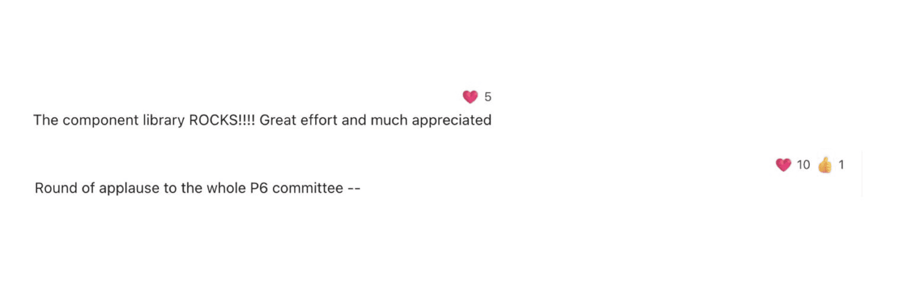
The library didn't stop at launch. I continuously tracked team feedback, usability issues, and gaps in the system—
using them to prioritize bug fixes, refine existing components, and introduce new ones as needs evolved. The library
reached its seventh iteration (V7) and evolved alongside the team's transition from Sketch to Figma.
As the system evolved in Figma, a token-driven approach uasing variable was explored—mapping foundational
values to semantic tokens to create a more scalable foundation for reusable components.


What's next
Future-Proofing the System: Scaled Knowledge & AI Navigation
What started as a shared component library revealed a broader opportunity: democratizing system intelligence
beyond asset files. We translated this framework into a centralized SharePoint onboarding hub to anchor
cross-functional alignment. Furthermore, our team initiated concept testing for an integrated AI Design Assistant
to automate pattern discovery, drastically lowering the cognitive load required for team members to navigate
complex system documentation.
Reflection
Designing for adoption, not just consistency
Building the system taught me that consistency alone doesn't make a shared library successful—adption does.
The harder challenge was creating enough clarity around each component that designers with different workflows
could understand, trust, and actually use the system.
It also shifted how I think about working within an existing brand system. Rather than seeing established constraints
as limitations, I learned to treat them as a foundation—one that could be made more accessible, scalable, and useful
for the people working within it.
Scaling Design Through a Shared System
Year
2023-2026
Role
Experience Designer
Skills
Component Architecture
Design Ops
Overview
The design system existed. The knowledge around it didn't.
Repeated launch work exposed the same friction: designers relied on scattered documentation, trackers, and team knowledge to understand which components were available and how they should be used. This often meant spending extra time searching for guidance, rebuilding familiar patterns, or asking teammates for answers that weren't documented in one place.
I saw an opportunity initiative to make that knowledge as reusable as the components themselves. I initiated a shared component system that brought reusable patterns, usage guidance, and documentation together
—helping designers work more efficiently while giving PMs, strategists, and enginerring partners clearer access to the information they needed.
Navigating the problem
Component information lived across disconnected guides, trackers, and files.
Fragmented knowledge
and critical usage knowledge lived in conversations rather than in the system.
Knowledge dependency
The opportunity was clear: make component knowledge as reusable as the components themselves.
Design Opportunity
How can a shared system make components easier to find, understand, and apply?
Design principles
Three principles shaped the system.
Contextual Efficiency
No more searching through scattered guides. Deploy device-specific components instantly to accelerate product delivery.
Single source of truth
Consolidate documentation into a single, living repository that scales seamlessly alongside product updates, guaranteeing design integrity.
Cross-Functional Language Governance
Bridge the gap between Design, Product, and Engineering. Establish clear rules so everyone builds from
the same page.
Building the system
Capturing the rules behind each component
Rather than simply recreating existing components, I focused on capturing the rules behind them—when they should be used, how they behave responsively, and what variations designers actually needed.
Scaling the system
One shared library for 150+ components
I organized reusable components and their supporting guidance into a shared library, creating a more consistent foundation designers could build from across projects.
The Impact & Adoption
From shared components to real product experiences
What began as a way to streamline the design workflow grew into a shared resource used across the team,
helping designers work from consistent components and patterns while reducing repetitive work across projects.
150+
components
centralized
80+
team members
supported
~65%
less time spent recreating
components and clarifying usage
01 Unified Handoff Language
Synchronized component terminology across UX, visual design, and engineering,
eliminating execution gaps and production friction.
02 Clearer Cross-Team Handoff
Replaced outdated assets with a centralized library, cutting out repetitive layout work so the team can focus purely on solving core user problems.
03 Easier Adoption at Scale
Established a clear onboarding framework that minimized learning curves, enabling new members to contribute instantly.
Continuous governance
From a shared library to a living system
The library didn't stop at launch. Our UX team continously tracked team feedback, usability issues,
and gaps in the system —using them to prioritize bug fixes, refine existing components, and introduce new ones as
needs evolved.
What started as a shared component library revealed a broader opportunity: democratizing system intelligence beyond asset files. We translated this framework into a centralized SharePoint onboarding hub to anchor
cross-functional alignment. Furthermore, our team initiated concept testing for an integrated AI Design Assistant
to automate pattern discovery, drastically lowering the cognitive load required for team members to navigate
complex system documentation.
What's next
Future-Proofing the System: Scaled Knowledge & AI Navigation
What started as a shared component library revealed a broader opportunity: democratizing system intelligence beyond asset files. We translated this framework into a centralized SharePoint onboarding hub to anchor
cross-functional alignment. Furthermore, our team initiated concept testing for an integrated AI Design Assistant
to automate pattern discovery, drastically lowering the cognitive load required for team members to navigate
complex system documentation.
Reflection
Designing for adoption, not just consistency
Building the system taught me that consistency alone doesn't make a shared library successful—adption does.
The harder challenge was creating enough clarity around each component that designers with different workflows could understand, trust, and actually use the system.
It also shifted how I think about working within an existing brand system. Rather than seeing established constraints
as limitations, I learned to treat them as a foundation—one that could be made more accessible, scalable, and useful for the people working within it.
Scaling Design Through a Shared System
Year
2023-2026
Role
Experience Designer
Skills
Component Architecture
Design Ops
Overview
The design system existed.
The knowledge around it didn't.
Repeated launch work exposed the same friction: designers relied on scattered documentation, trackers, and team knowledge to understand which components were available and how they should be used. This often meant spending extra time searching for guidance, rebuilding familiar patterns, or asking teammates for answers that weren't documented in one place.
I saw an opportunity initiative to make that knowledge as reusable as the components themselves. I initiated a shared component system that brought reusable patterns, usage guidance, and documentation together —helping designers work more efficiently while giving PMs, strategists, and enginerring partners clearer access
to the information they needed.
Navigating the problem
Component information lived across disconnected guides, trackers, and files.
Fragmented knowledge
and critical usage knowledge lived in conversations rather than in the system.
Knowledge dependency
The opportunity was clear: make component knowledge as reusable as the components themselves.
Design Opportunity
How can a shared system make components easier to find, understand, and apply?
Design principles
The design system existed.
The knowledge around it didn't.
Contextual Efficiency
No more searching through scattered guides. Deploy device-specific components instantly to accelerate product delivery.
Single source of truth
Consolidate documentation into a single, living repository that scales seamlessly alongside product updates, guaranteeing design integrity.
Cross-Functional Language Governance
Give designers, PMs, and partners a shared understanding of how components work and when to use them.
Building the system
Capturing the rules behind each component
Rather than simply recreating existing components,
I focused on capturing the rules behind them—when
they should be used, how they behave responsively, and what variations designers actually needed.
This annotation system also created a shared language between design and engineering, reducing ambiguity
during handoff.
Scaling the system
One shared library for 150+ components
We organized reusable components and their supporting guidance into a shared library, creating a more
consistent foundation designers could build from across projects.
The Impact & Adoption
From shared components to real product experiences
What began as a way to streamline the design workflow grew into a shared resource used across the team,
helping designers work from consistent components and patterns while reducing repetitive work across projects.
150+
components
centralized
80+
team members
supported
~65%
less time spent recreating
components and clarifying usage
01 Unified Handoff Language
Synchronized component terminology across UX, visual design, and engineering,
eliminating execution gaps and production
friction.
02 Clearer Cross-Team Handoff
Replaced outdated assets with a centralized library, cutting out repetitive layout work so the team can focus purely on solving core user problems.
03 Easier Adoption at Scale
Established a clear onboarding framework that minimized learning curves, enabling new members to contribute instantly.
Continuous governance
From a shared library to a living system
The library didn't stop at launch. I continuously tracked team feedback, usability issues, and gaps in the system—
using them to prioritize bug fixes, refine existing components, and introduce new ones as needs evolved. The library
reached its seventh iteration (V7) and evolved alongside the team's transition from Sketch to Figma.
What started as a shared component library revealed a broader opportunity: democratizing system intelligence
beyond asset files. We translated this framework into a centralized SharePoint onboarding hub to anchor
cross-functional alignment. Furthermore, our team initiated concept testing for an integrated AI Design Assistant to automate pattern discovery, drastically lowering the cognitive load required for team members to navigate complex system documentation.
What's next
Future-Proofing the System: Scaled Knowledge & AI Navigation
What started as a shared component library revealed a broader opportunity: democratizing system intelligence
beyond asset files. We translated this framework into a centralized SharePoint onboarding hub to anchor
cross-functional alignment. Furthermore, our team initiated concept testing for an integrated AI Design Assistant to automate pattern discovery, drastically lowering the cognitive load required for team members to navigate complex system documentation.
Reflection
Designing for adoption, not just consistency
Building the system taught me that consistency alone doesn't make a shared library successful—adption does.
The harder challenge was creating enough clarity around each component that designers with different workflows
could understand, trust, and actually use the system.
It also shifted how I think about working within an existing brand system. Rather than seeing established constraints
as limitations, I learned to treat them as a foundation—one that could be made more accessible, scalable, and useful
for the people working within it.