Optimizing the checkout process

Year

2023-2024

Role

Experience Designer

Skills

Product Design

User Research

Prototyping

Overview

Optimizing the multi-device checkout funnel

The legacy checkout experience forced customers to navigate multiple interconnected decisions —from

device configuration and storage to trade-ins and promotions. Without a clear hierarchy, users struggled

to track how each choice impacted their final price, triggering severe drop-offs. I owned the end-to-end

UX execution for this multi-surface checkout strategy, translating user behavior data into a simplified,

high-conversion purchasing journey.

The legacy checkout experience forced customers to navigate multiple interconnected decisions —from device configuration and storage to trade-ins and promotions. Without a clear hierarchy, users struggled

to track how each choice impacted their final price, triggering severe drop-offs.

I owned the end-to-end UX execution for this multi-surface checkout strategy, translating user behavior

data into a simplified, high-conversion purchasing journey.

The legacy checkout experience forced customers to navigate multiple interconnected decisions —from device configuration and storage to trade-ins and promotions. Without a clear hierarchy, users struggled to track how each choice impacted their final price, triggering severe drop-offs.

I owned the end-to-end UX execution for this multi-surface checkout strategy, translating user behavior data into a simplified, high-conversion purchasing journey.

Business Need

Maximize conversion


Reduce friction and abandonment by creating a clearer path through product configuration, trade-in, and promotional decisions.

Maximize conversion


Reduce friction and abandonment by creating a clearer path through product configuration, trade-in, and promotional decisions.

User Need

Purchase with confidence


Help customers understand what they’re choosing, why each decision matters, and how it affects the final price.

Purchase with confidence


Help customers understand what they’re choosing, why each decision matters, and how it affects the final price.

Discovery

Where did the purchase journey become difficult?

Where did the purchase journey become difficult?

Purchasing a modern device is rarely a single click. Users had to navigate a sequence of complex dependencies:

balancing trade-in valuations, color choices, and storage upgrades, all while trying to decipher their final total.

The lack of visual anchors turned a simple checkout into a stressful math problem.

Customers weren’t making a single purchase decision. They were navigating a sequence of interconnected

choices —from trade-in and color to storage and additional purchase options while trying to understand what

they would ultimately pay.

Research & Insights

Uncovering the core friction points

Uncovering the core friction points

Analytics revealed a high-friction purchasing environment. A staggering 84% daily exit rate flagged an

critical drop-off during configuration, while trade-in steps emerged as the single highest source of user drop-off.

Performance Audit: Evaluated funnel interaction data to isolate the structural design barriers causing immediate cart abandonment.

84% Early Exit

Confirmed massive, immediate user drop-off the moment consumers entered the desktop configurator.

52.2% Trade-in Engagement

Isolated the exact step where users abandoned the checkout due to unclear valuation logic.

But the data showed where users struggled —not why.

But the data showed where users struggled —not why.

Quantitative data highlighted the exact drop-off points, but it didn't explain the human behavior behind them.

Behavioral analytics were paired with qualitative usability testing and deep-dive user interviews to uncover

the root causes of checkout hesitation.


01 The Configurator Disconnect: Visitors converted at 4.47% across other areas of s.com, but order rates

collapsed to 0.37% here, driving the 84% early exit. The single-page layout forced everyone into a

high-friction path, completely failing to accommodate diverse user pathways.


02 Pricing Transparency Gap: Trade-in showed strong engagement, but its relationship to the final price was

difficult to understand within a complex configuration journey. Users needed clearer feedback on how each

decision changed what they would ultimately pay.


Quantitative data highlighted the exact drop-off points, but it didn't explain the human behavior behind them.

Behavioral analytics were paired with qualitative usability testing and deep-dive user interviews to uncover the root causes of checkout hesitation.


01 The Configurator Disconnect: Visitors converted at 4.47% across other areas of s.com,

but order rates collapsed to 0.37% here, driving the 84% early exit. The single-page layout forced

everyone into a high-friction path, completely failing to accommodate diverse user pathways.


02 Pricing Transparency Gap: While Trade-In was the most popular element with 52.2% engagement, complex configuration layers altered final pricing at unpredictable intervals, leaving users guessing what they would ultimately pay.


What it added up to

Customers weren't struggling with choices.
They needed more clarity around each decision.

Customers weren’t struggling with choices.
They needed more clarity around each decision.

Research pointed to a broader issue beyond the number of options: customers had to navigate interconnected

decisions without always understanding their order, context, or impact on price. This shifted the focus from

simplifying individual screens to improving the structure of the decision journey itself.


The challenge wasn’t simply the number of options—it was how those decisions were sequenced, structured,

and communicated throughout the journey.


Design Opportunity

How might we turn checkout complexity
into purchasing confidence?

How might we turn configuration complexity into purchase confidence?

Design Strategy

Reducing friction across three layers of the experience

Reducing friction across three layers of the experience

Research insights were translated into three distinct areas of focus, addressing not only what customers saw,

but when decisions appeared and how information was prioritized.

01 Sequence

Strategic sequencing: Reconsider when key pricing decisions enter the purchase journey to prevent early-stage choice paralysis.

02 Structure

Price Clarity:Eliminate calculation anxiety. Render live pricing updates for trade-ins and active rewards instantly.

03 Emphasis

Visual Hierarchy: Kill the clutter and maximize contrast to isolate core hardware choices from aggressive marketing noise.

Design exploration

Where Should Pricing Enter the Journey?

Where Should Pricing Enter the Journey?

Competitive analysis revealed no consistent pattern for where trade-in appeared in the purchase journey.

Yet behavioral data showed strong engagement with trade-in, while user research highlighted uncertainty

around changing prices.


01 No universal sequence: Competitors structured configuration and trade-in differently, suggesting that

position alone wasn't the answer.


02 A meaningful price lever: Trade-in had a significant impact on perceived price, making it an important

decision to surface with enough context and visibility.

What if the biggest price decision came earlier?

What if the biggest price decision came earlier?

With 52.2% of desktop users engaging with trade-in, I explored whether surfacing this high-impact decision

earlier could establish clearer price expectations before customers made additional configuration choices.


Quantitative data highlighted the exact drop-off points, but it didn't explain the human behavior behind them.

Behavioral analytics were paired with qualitative usability testing and deep-dive user interviews to uncover the root causes of checkout hesitation.


01 The Configurator Disconnect: Visitors converted at 4.47% across other areas of s.com,

but order rates collapsed to 0.37% here, driving the 84% early exit. The single-page layout forced

everyone into a high-friction path, completely failing to accommodate diverse user pathways.


02 Pricing Transparency Gap: While Trade-In was the most popular element with 52.2% engagement, complex configuration layers altered final pricing at unpredictable intervals, leaving users guessing what they would ultimately pay.


INITIAL EXPLORATION

Leading with trade-in


Evaluating trade-in at the very beginning of the journey so users can lock in primary savings immediately.


Leading with trade-in


Evaluating trade-in at the very beginning of the journey so users can lock in primary savings immediately.


TIMELINE ROTATION

Design exploration

Structuring a Content-Dense Flow

Structuring a Content-Dense Flow

The legacy checkout stacked promotions, fine print, and hardware choices into one long vertical layout. The lack

of visual boundaries caused severe scroll fatigue, prompting 84% of high-intent users to abandon the configuration.

FLOW OPTIMIZATION

FLOW OPTIMIZATION

Predictable feedback loops


Consolidated Classic and Bespoke pathways into a clean horizontal tab. This re-architecture anchored active choices within fixed container boundaries, completely eliminating sudden page layout distortion.


Predictable feedback loops


Consolidated Classic and Bespoke pathways into a clean horizontal tab. This re-architecture anchored active choices within fixed container boundaries, completely eliminating sudden page layout distortion.


FLOW OPTIMIZATION

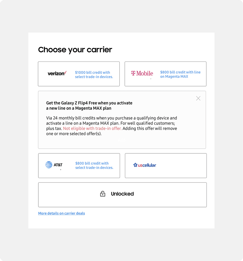
Intent-driven progressive disclosure


Instead of flooding the grid with upfront promotional data, carriers were converted

into expandable components.


Intent-driven progressive disclosure


Instead of flooding the grid with upfront promotional data, carriers were converted into expandable components.


Design exploration

Transforming semantic colors and component states for visual clarity

Transforming semantic colors and component states for visual clarity

The legacy interface relied on volatile component states and ambiguous color treatments. Selecting options

triggered chaotic layout shifts that wedged massive promo text between cards, while orange callouts caused

visual panic by mimicking error states. The interface failed to deliver a clean feedback loop.

The legacy interface relied on volatile component states and ambiguous color treatments. Selecting options triggered chaotic layout shifts that wedged massive promo text between cards, while orange callouts caused visual panic by mimicking error states.

The interface failed to deliver a clean feedback loop.

VISUAL SEMANTICS

Correcting color semantics


Replaced confusing orange text strings with a system-compliant brand blue palette. This removed false error signals, translating marketing perks into high-trust visual cues.


Correcting color semantics


Replaced confusing orange text strings with a system-compliant brand blue palette. This removed false error signals, translating marketing perks into high-trust visual cues.


Applying the direction

Bringing the direction into the complete journey

Bringing the direction into the complete journey

The concept was then applied across the full purchase journey—simplifying the hierarchy, maintaining context

between selections, and making price changes easier to follow.

Refining the direction

The full journey revealed a new consideration

The full journey revealed a new consideration

As the design came together across the complete checkout flow, reviewing the experience with the broader

team surfaced an important sequencing question: when should customers encounter trade-in?


01 Price visibility: Trade-in had one of the largest impacts on the final price

02 Product context: Storage and color helped customers establish the product before considering additional savings.

As the design came together across the complete checkout flow, reviewing the experience with the broader team surfaced an important sequencing question: when should customers encounter trade-in?


Price visibility: Trade-in had one of the largest impacts on the final price

Product context: Storage and color helped customers establish the product before considering additional savings.

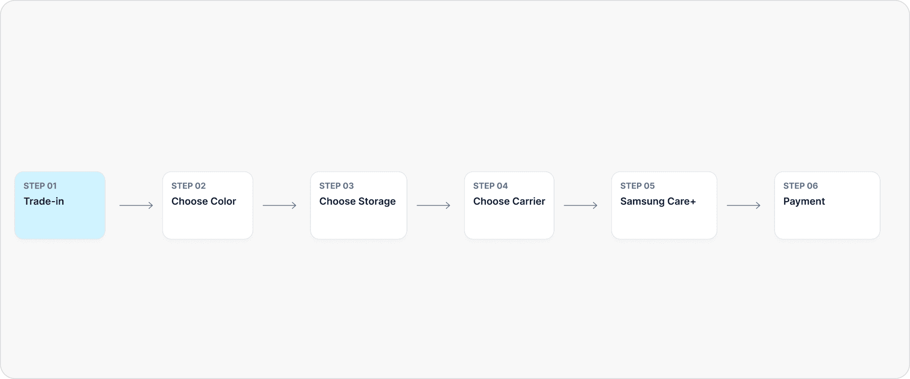
Bringing trade-in forward addressed pricing visibility, but viewing the concept within the complete journey revealed

a broader sequencing need. Color and storage moved ahead so customers could establish the product before considering additional savings.

Initial direction

Lead with price impact

Lead with price impact

Refined sequence

Build product context first

Build product context first

An important decision doesn't always need to come first —it needs to appear when customers have the

right context.

An important decision doesn't always need to come first —it needs to appear when customers have the right context.

Refined experience

Refining the sequence while preserving trade-in clarity

Refining the sequence while preserving trade-in clarity

The initial direction had a clear rationale: bring trade-in forward to make its price impact more visible. But once the

design came together within the complete journey and was reviewed with the broader team, another consideration

emerged—customers needed enough product context first. The sequence evolved to balance both needs, while

preserving the core trade-in redesign and its clearer approach to savings and pricing.

The initial direction had a clear rationale: bring trade-in forward to make its price impact more visible. But once the design came together within the complete journey and was reviewed with the broader team, another consideration emerged—customers needed enough product context first. The sequence evolved to balance both needs, while

preserving the core trade-in redesign and its clearer approach to savings and pricing.

Bringing trade-in forward addressed pricing visibility, but viewing the concept within the complete journey revealed

a broader sequencing need. Color and storage moved ahead so customers could establish the product before considering additional savings.

Outcome & adoption

Adapting the approach across products

Adapting the approach across products

The refined experience was positively received by the client team, particularly for bringing greater clarity and

continuity to a complex purchase flow.


The underlying principles carried into other product experiences, while the sequence and interactions continued

to adapt to each product's unique purchase journey.


Working within a large, highly matrixed organization reinforced that simplifying checkout requires more than reducing visual elements. It requires balancing user needs with business priorities, technical constraints, and evolving commerce requirements. This project showed that clarity comes from both visual hierarchy and the thoughtful sequencing of decisions.


Working within a large, highly matrixed organization reinforced that simplifying checkout requires more than reducing visual elements. It requires balancing user needs with business priorities, technical constraints, and evolving commerce requirements. This project showed that clarity comes from both visual hierarchy and the thoughtful sequencing of decisions.


Strategic reflection

Designing for clarity, not just feature density

Designing for clarity, not just feature density

Working within Samsung's checkout ecosystem reinforced that simplifying a purchase journey wasn't about removing

choices—it was about organizing them.


Every decision carried competing considerations across customer needs, business priorities, and implementation

constraints. Designing clarity meant balancing those considerations through visual hierarchy, interaction design, and

thoughtful sequencing, considering how each decision worked within the larger purchase journey rather than in

isolation.


The biggest lesson was that clarity comes from sequencing, not just simplificaiton. The strongest solution balanced

price visibility with product context, placing each decision where it could be most useful without losing the intent

behind the original design.


Working within a large, highly matrixed organization reinforced that simplifying checkout requires more than reducing visual elements. It requires balancing user needs with business priorities, technical constraints, and evolving commerce requirements. This project showed that clarity comes from both visual hierarchy and the thoughtful sequencing of decisions.


Working within a large, highly matrixed organization reinforced that simplifying checkout requires more than reducing visual elements. It requires balancing user needs with business priorities, technical constraints, and evolving commerce requirements. This project showed that clarity comes from both visual hierarchy and the thoughtful sequencing of decisions.


Interested to work with me?
Let's chat☕️

9:46:11 AM

Interested to work with me?
Let's chat☕️

9:46:11 AM

Interested to work with me?
Let's chat☕️

9:46:11 AM